I am going to create some plans for my magazine advert so I can visualise and compare my ideas. Here are two rough plans I created:
For the images in the magazine adverts, I came up with these ideas from shots planned for our music video. I wanted to use these to show links between the music video and the magazine advert to create a theme. This will allow the products to be clear to the audience that they are from the same song. I considered the positioning of the artists based on the story of the song. I wanted to create tension between them because they are sad about each other. I did this in the first plan by making them walk away from each other whilst looking back to show that they want to see each other but they can't as they are upset, and in the second plan I have the artists looking down away from each other to show they are feeling down and cant forgive.
Most of the text is written in capitals to make it bold and stand out and I included the title at the top of the page in bigger writing because its the most important information. This is because the audience cant buy, download or listen to the song if they don't know the name of it, therefore the title must be clear.
In terms of colour I haven't actually added any on my plans, but the colours would be quite vibrant because of the lighting I have considered. In the first plan I included a sunset which would probably silhouette the characters if I took it in real life. This type of lighting will give the surroundings quite a vibrant effect but also make the picture quite dark in the foreground. My purpose of using a sunset is because it will connote the ending between them like the end of a day. In the second plan I have included fairy lights which would create subtle lighting behind them making them and their surroundings quite dark which is also connoting this sad time. The lighting in these shots are important for setting the mood and showing the emotion in the song so the audience know what to expect when they listen to it.
This will suit my target audience of young adults because we have used young adults in the shots and they showing heartbreak between them which a lot of people often go through around this age. We also considered the target audience in the settings as well. In the first plan, a park is quite a common location that young adults and teens would go to in the summer or for a date. In the second plan, I included fairy lights which is quite girly and would be often seen in a girls bedroom or at Christmas.
The most important aspect of the magazine advert is that there is a consistent theme between it and the digipak and music video which I believe is clear because we have used the same settings and props throughout for the shots. The reason it must be clear is so that the audience will easily be able to recognise the song by seeing these visuals. This will allow synergy as each product will promote each other.
In terms of music genre, the magazine suits pop because of our theme. I created the first plan based on the narrative to link to aspects of the pop genre because its showing a sad moment of break up and emotion in which lots of pop songs are about relationships. With the second plan I based it on the performance which links to pop because they are holding microphones but also still showing that emotion between them as they are looking away.
In terms of composition I don't think the layout of the writing works significantly well so I will need to consider this more when creating the final outcome. Previous research I have done has helped me a lot with knowing what is expected of a magazine advert and what to include. I noticed when looking at other magazine adverts the visuals all linked to the title so I need to make sure you can strongly see this in my final outcome. Creating these plans has helped me to see a visual interpretation of my ideas and has allowed me to compare and develop my ideas for when I create my final outcome.
Now that I have done a lot of research on digipaks I need to use what I have learnt and my ideas to start piecing together and planning out what I am actually going to do for it. I want to create plans to help me visualise my ideas before I make the real thing and I will be able to compare and develop my ideas to see what's best.
These are two plans I came up with:
I came up with this idea with some of the shots we had planned to use for our music video. I did this because I wanted the digipak to match the theme of it. For font I considered having the words written in capitals so it stood out as was quite bold. I included the title of the song, the artists names, lyrics from the song, and the record label. I may add more context to it to improve for the real digipak. In terms of colour scheme I want the pictures to be from a similar environment so there is a consistent theme but I also want the colours to match what's used in the music video. I have considered target audience by having the artists on the front cover and using objects like fairy lights / photos to make the digipak aesthetically pleasing and quite girly. This will help to draw in an audience consisting of teenagers and young adults. I believe it suits our genre because of how much we have used the artist and how it matches this theme that common / pop artists use. We tried to make it a similar theme to the actual artists style on their albums to help us with understanding their target audience and what they use to direct their work at their type of audience specifically. Our main focus however was making sure it linked to our music video because we wanted there to be a theme so it was clear to our audience what the style of this music video is and so that the digipak and music video can help promote each other.
This work has helped me for creating my digipak because I know have a base to work and develop from for my final outcome. This has allowed me to create a visual interpretation of my ideas so I can compare my ideas and see what worked and what didn't. I now need to collect some images together to create my digipak with and also keep this theme consistent with my magazine advert too.
My first chosen artist is Shawn Mendes and for his album 'Handwritten' you can see a clear link between the magazine advert and the digipak. They have used the same image and colour scheme throughout and kept this theme of handwritten text around him. I like this idea of the handwritten font used because it matches the theme of the music. One downside to this is that the magazine cover is the exact same picture as the front cover of the digipak and I think this makes them look too similar. Therefore I can learn from this and look into using different imagery whilst keeping the theme and colours the same. I still could use the same image for the front of my magazine advert as well as my digipak to keep the theme consistent I just need to make sure in my digipak to use other images too. In terms of target audience, Shawn Mendez attracts a young audience because of his age, also because he is a male he attracts more of a female audience. However his music is listened to by a verity of different people. I can see how target audience has been considered in his products as you can see he's tried attracting young females by adding a picture of him on the front and he's kept the cover subtle/simple so to make it as if there's nothing to dislike about it so its suitable for everyone. Looking at the style Shawn Mendez goes for has helped me get an idea of what works for my genre of music and target audience so I will use his products to help me develop some of my ideas.
Digipak:
Magazine Advert:
My second chosen artist is Camila Cabello. I couldn't find much in terms of digipaks and magazine adverts however I found album covers of her recent singles. You can see a clear theme throughout her products for example there is a plain coloured background in which colours used are all very vibrant and the same font is used. In one of them a bright red is used and the other is yellow which makes Camila stand out and the attention is drawn to her. Also adding the green leaves adds pattern to the design and more colour which makes it seem more summer themed and tropical. The same font is used throughout which is a very bold font written in capitals which stands out a lot especially with the plain coloured background behind it. I think the title on the 'OMG' cover doesn't stand out that much because the writing is a lot smaller and its at the bottom of the design. Therefore I know its important to consider how big I have my own title and where it should be positioned to make it clear to the audience what the name of the song is. Next to the title the name of the artists name is written as that's the name most important information. I have noticed that they are kept very basic and not a lot of text is on them. Its mainly visuals that are used to attract an audience. In terms of images, the artist has been included on the front cover. On the top two covers I like how they have used the same picture of the artist with a different background because it makes it clear they are different songs but have still kept the theme. The bottom cover has a different picture of the artist to help make it clear its a different song to 'OMG' as they have the same background. In terms of audience, Camila is a pop artist so her target audience isn't very specific but quite broad. You can see evidence of this in her covers because they are kept simple and basic like Shawn's so there's not a lot for people to dislike about it and anyone can like it. I really like the colour theme that she's used throughout but I think this only works with multiple songs and I am only creating one. Therefore I probably wont use this idea. However I will use this research to consider my title in terms of how its presented and where on the design it is placed as I have learnt it is an important aspect of this project.
Album covers (digipak):
When I compare both artists work I have actually realised they are quite similar in terms of target audience and visuals. They both target a young female audience but not specifically as there work is made simple to attract a more broad audience. In terms of visuals they both have had a shoot at with a green screen with the background edited in. I most likely won't do this in my digipak or magazine advert because I want the background to match the theme of the music video as well and we won't be using a green screen for a background.
Overall by doing this task I have more of an understanding of who my chosen artists are and what sort of work they have produced which has helped me understand their type of style and target audience. Therefore when I create my own digipak and magazine advert I have an idea of what is expected in terms of what style is best suited for my artists and what to include on them. However I need to make the style of my design work with the song as well as they artists style because my chosen song is more emotional than these songs probably are so it would probably work to use darker colours. Yet I can use this research I have done on my chosen artists to help me develop my ideas whilst making sure they attract the right audience and meet the expected standards for pop music products.
The song we have chosen for our music video is 'I Know What You Did Last Summer' and it is sung by two artists; Shawn Mendes and Camila Cabello. I am going to research about my chosen artists to help me understand their style and target audience so I have an insight of what's expected from the song I have chosen and how they would base their music video around it. Therefore this will help me understand the song and what sort of content I need to include.
Shawn Mendes
Shawn Mendes is a Canadian singer aged 19. He became a singer mainly through social media and gaining popularity through sites like YouTube and Facebook. Therefore through this more and more people discovered him and liked his music and this is what formed his fan base. His genre of music is pop and his style is quite acoustic as he plays guitar. They are often about relationships and are quite catchy and upbeat. He is quite young and good looking so his target audience mostly consists of teenage girls and young adults. However he is also a role model/inspiration to males around his age and younger too because of his style. His style of quite casual and specific, not very outgoing and he doesn't exactly stand out. Its quite a common style for a male his age and looks as if you could buy his clothes from high street stores.
I created this mood page on Shawn Mendes so I can look into who how is visually and how he comes across to his audience. Looking at themes he seems quite basic and fits in with the trends - he doesn't have a specific style to himself and goes with a common style that males his age often go for. He plays guitar so he must play some quite acoustic songs and maybe does covers to songs too in his own version. The facial expressions used throughout range from him smiling and being happy to being worried to him being angry. This shows his songs must include a lot of emotion, as well as his music videos for them. In terms of colours, they are quite dull and dark. The visuals used for him aren't very colourful in terms of what he wears and his surroundings. I believe this is because a lot of his music is quite emotional and about heartbreak so the visuals are dark to set the mood. I know that Shawn Mendes mentioned he hasn't really suffered from heartbreak even though all his music is about it, therefore they can't be about personal experience to him. The reason I think a lot of his songs are about heartbreak is because it allows him to talk about a girl and he can make out the song like he's singing to his audience and that they are the girl he is talking about because his target audience is females. In terms of his style, he is quite young and casual which doesn't make him stand out and more like fit in. Big pop artists like lady gaga, Madonna, Michael Jackson, Beyoncé, and Britney Spears all have their own style that is extreme and unique to make them stand out from the crowd. As Shawn isn't as big of an artist, he needs to keep with the trend to gain popularity before he starts being unique in terms of his look. However he isn't a typical male solo artist as their are some small aspects to him that do make him unique. For example he has a very distinctive voice that's unique so you can easily tell its him singing which allows him to stand out in his own way without being extreme. In terms of his personality, you can tell he is young and happy. He is hardworking because he puts a lot of work into his music for example he has written his own songs and puts a lot into his music videos.
Here are a couple music videos by Shawn Mendes:
Holding me back
Stitches
When I look at the emotion used in both this music videos I can see the similarity in terms of how much emotion is portrayed throughout them. The difference is that in the first music video Shawn is very happy and in love with a girl. But in the second music video he is sad, angry and heartbroken. He is weak and not happy. This shows emotion is key is his music videos to portray the narrative so I need to consider this in my own music video. Both songs are upbeat which work well for music videos as its easier to cut to the beat and work with the pace. In terms of the amount of content used, in the first music video there is a lot because they filmed in all sorts of locations with different equipment and camera angles. However in the second music video its basically filmed in the same location for the whole thing. Personally I think this makes the music video quite boring as your watching the same sort of thing throughout. In terms of narrative there is a lot used in the first music video because it shows him and the girl he is with having a good time and what they have done on their trip to Paris. In the second one there is narrative involved which shows Shawn becoming weak because of the relationship he is in and includes a lot of emotion. In terms of performance
Camila Cabello
Camila Cabello is a 20 year old singer from Havana, Cuba. She is Mexican-Cuban but lives in America now. She is a pop singer and was originally in a girl band called fifth harmony. They became well known by coming third in Americans version of The X Factor. From then on they were very popular and successful and then Camila left the group to become a solo artist. She is a pop artist with a very distinctive voice and her music is normally very up beat and about her personal experiences. Like Shawn, she keeps up with the trends rather than creates them. She's quite young and wears casual clothing like anyone of that age would. Her music videos often include a lot to them in terms of performance and narrative for example when she was in the girl band they would create sets and choreography for the music video. In terms of audience, Camila has a similar target audience to Shawn as she is young and is female so she will have a female fan base who see her as a role model. More specifically, her audience are probably more aimed at teens than people her age in terms of who she is as a person, however with her style of music she attracts quite a broad audience like Shawn because its pop music so its really enjoyable to anyone. Her music is also commonly played a lot and in the charts so a lot of people like her. She used to be in a girl band however she would still have the same sort of fan base because she hasn't changed herself and her style. Also the younger girls who like her would probably still listen to her now.
I created a mood board on Camila Cabello so I can get some visuals of what shes like, what her style is, etc. In terms of her theme, she is quite young and has a cute girly look to her. She shows a lot of confidence in her shoots and on stage as she acts with the style of music and if good at the performance aspect of her job. In terms of colours, I can see a lot of vibrant colours in her costumes/outfits and covers which draws a lot of attention to her and makes her stand out. The colours are bright but not specific. In terms of her style she is quite girly and fits in with the trends but she wears them in her own way which makes her wear them well. For example the outfit she wore on stand with the red top and white trousers, I know at the moment these trousers with the lace up legs are in fashion at the moment. However they are baggy and white with black lace where as at the moment the fashion is black and tight trousers with black lace. Therefore she is made the fashion her own style. This allows her to set trends as well and draw in a target audience. On stage, because she used to be in a group, they would wear similar costumes to match each other and have a theme. An example of this is the blue outfit she wears in the image on the bottom row. It looks like it was made for her to perform in as it isn't really something you would wear out in public but something for performing in. In terms of personality, when I look at these images, I can tell she is quite girly because she wears outfits that are considered girly like skater skirts and heels. However I can also tell she is quite confident because of the way she dances and holds herself on stage. She appears quite expressive and looks like she is having a good time on stage and she puts a lot into her shoots and shows emotion in her pictures. For example the photo in the top left she looks quite fierce and confident.
Here are a couple music videos by Camlia Cabello:
Havana
Crying in the club
When comparing these music videos I have noticed that they are completely different styles of pop songs in terms of how upbeat they are and their themes. Havana is very upbeat and has quite a cultural theme to it because its about a place. Crying in the club is quite emotional so its slower paced to make it suit the mood of the song. Both songs contain a lot of performance aspects as in Havana Camila stands on a stage and sings then she dances during the rap part. In Crying in the club she lip syncs the song in a room and dances to it. In terms of narrative they are very different as Havana contains a lot more narrative than Crying in the club which doesn't show a story at all it just expresses emotion. Havana has a whole story within the music video showing a girl watching a film (which is actually herself) called 'Camila in Havana' about love and it shows her performing in a club. This version of Camila inspires the realistic Camila to be like her. At the beginning shes watching a film with Camila who is a telenovela actress and has just walked in on her lover with her best friend and her maid. I like how much narrative has been put into this music video because I think its a good amount to keep someone intrigued with the story and want to watch the whole thing. However I don't think I would have a huge story at the beginning before the music begins in my music video because I would rather show the story within the performance to the music otherwise there will be too much content. In terms of target audience I feel like Havana will be liked by a more broad audience because its upbeat and catchy compared to Crying in the Club which is more slow and emotional. Yet I do think both music videos target the same audience which is young females - teenagers / young adults. In Havana i see this because shes a young girl who wants to watch a film so she has to sneak out to go to the cinema which is what a young may do or relate to. In Crying in the Club its a slightly older audience but what she wears and how she dances will attract a younger audience. Her age plays a huge role in the type of audience she attracts because people her age and younger will see her as an inspiration for trends and confidence but also a role model.
Overall by doing this research on my chosen artists this has allowed me to understand who my chosen artists are in terms of their style, target audience, personality, theme, etc. This has allowed me to learn about how they attract their target audience/fan base and see what people like about them. I could make use of this by considering the style, costumes, themes, etc for my own music video and the people we will have playing the artists. This will help guide me to draw in the correct target audience and work in a similar style to these types of artists.
Our chosen genre is 'Pop' as it gives off positive vibes and is generally a very upbeat genre to go by of most songs. Its also the most commonly listened to genre, so it gives us a wide verity of demographics to choose from. Our chosen song is 'I Know What You Did Last Summer' by Camila Cabello and Shawn Mendes, which is from the pop genre. I am going to do some research into our genre so I can see what it consists of and properly understand it. This will help me have an idea of what content to involve for my own music video to make it suit our chosen genre.
Pop is term that is used short for the word 'popular'. The first time the term was ever used to describe music, was in 1926. Pop is a genre which can include a mix of many other styles of music which vary from jazz, to country to rock etc. What makes a song become a 'pop song' is the style of the artist, the target audience and how popular it actually is. With the genre of pop it has quite a verity of properties in terms of the style of music and style of artist because the idea is to be unique so you can stand out from other artists to get the biggest audience and be at the top of the charts. Here are some examples of pop around the music industry.
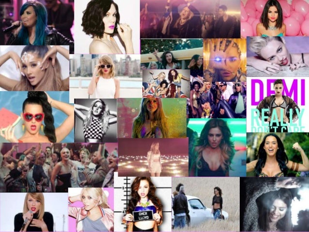
From this mood board based upon pop music, it brings off a similar pattern throughout the pictures. It includes very colourful images with people who have a their own look and style. Usually in pop music videos, you will see that the artist will be unique with there look and fashion sense so they can start a trend and be unique. A few pop artists who are famous for their style of fashion are Britney spears, Michael Jackson and lady gaga. In general, most pop artists who aren't as big will be up to date with the latest/most fashionable clothing and get inspiration from bigger artists. This is because pop is mostly targeted at a younger audience as it is mostly the younger generation who enjoy listening and watching pop music, so to start growing a fan base, newer pop artists will work with the trends that this particular audience like before trying to stand out and become more known as a celebrity rather than for their work. This genre consists of music that can be fairly realistic and relatable to an audience even if they have extreme / unrealistic music videos. A lot of songs are about love and relationships which makes the songs realistic to peoples lives. Yet, the genre of pop music uses certain techniques to gain an audience by showing a sense of enjoyment and thrill making the songs catchy and stay in your head. Pop is a very big industry for artists to be getting into, so it being quite famous, artists will produce more pop songs to make their profile larger. However because it is so big, it is very competitive so not a lot of artists become successful. A lot of artists are now becoming of the 'Indie Rock' genre as its beginning to become more popular to audiences and the industry isn't as big as pop so it is easier to get into. On this moodboard we can see Ariana Grande, Adele, Jessie J and a lot more famous artists, these people are very big in the industry and popular from many different audiences. This reinforces that big artists are unique in their own ways with allows them to stand out and have their own fan base.
Pop music is usually constructed into different formats of the song, they use repetition of the beats and the chorus to make it sound catchy but also to put that message of the narrative across to the audience. This can be seen by the hypodermic needle theory, saying some sort of message to the audience by the use of repetition in the lyrics. Pop is targeted to more of a general audience - its suitable for everyone. For example although younger people are more likely to enjoy it more, it doesn't mean the older people won't. The genre typically focuses on generic themes like love and relationships, so its relatable to anyone.
Here is an example :
Here are two very different types of pop music videos:
The song, artist, and music video are all very different from each other. Britney wears extreme costumes to make her stand out and start a trend because she stands as a role model for her type of audience. She uses bright colours, has a lot of narrative which is quite fantasised, there's a lot of editing involved and the song is very upbeat making the shots quite fast paced. Britney also includes herself within the narrative of her music videos - she is the main character. Adele wears dull colours as well as dull settings, she mainly just performs in her music videos and isn't involved with the narrative aspects, and the song still has a beat but its a lot slower making the music video slower paced. The sort of content Britney uses is quite hyperealistic so she takes reality to the next level. Adele is very basic with her content, a little goes a long way in her music videos. There are so many differences however they are both of the pop genre. They seem so different from each other but they do have many similarities that make them both pop artists. For example they both have their own style to make them unique and stand out, their songs are both very catchy, and the narrative is based around love. In terms of Goodwin's theory, they both use a lot of close ups, and they both include aspects of performance and narrative. These two music videos can represent how broad the music genre of pop is in terms of style of music and the artist.
Overall by doing this research I have found out how broad the pop genre is which has allowed me to understand how important it is that I make my music video specific towards theme and style so it stands out and creates a style for the artist. I will need to research about my chosen artist to understand their style and see how to attract our target audience. This research has helped me understand the genre and given me an idea of what is expected for making my own music video.
Initially for our music video, we considered various different ideas from the research we conducted. For example the genre/type of music video we wanted to create. We came up with the idea of having a duet with a male and a female. We found this idea constructive, as it would fit in with the narrative based music video we wanted to create, which was a deep meaningful story line between two characters. The first song we came across was 'Up' by Demi Lovato and Olly Murs, this was a duet and incorporated the narrative we desired, which was about a couple breaking up. We decided that this song was too popular, and wanted it to be more niche, so carried out some more research.
We then found the song 'Airplanes' by Hayley Wiliams and B.O.B, this included a fantastic narrative between two people talking about how their life is bad, and could really do with a wish to change it all. The only downside to this, was it included a lot of rap, which didn't suit the genre we desire and what would best suit our target audience.
After that, we discovered the music video 'We Don't Talk Anymore' by Selena Gomez and Charlie Puth, this also included the duet with a good narrative behind it. The narrative was about a couple who have broken up and how they aren't really coping with their lives without each other. This was showed through the use of a split screen. We really liked the idea of this and hope to use this feature in our music video.
Our initial ideas for genre was using the idea of having a mix of different ones, to widen our target audience and get a variety of different people who are interested in all types of music. This way by have multiple genres, it would attract a bigger group of people. But we thought, mixing a pop based music video with other genres, it wouldn't piece together probably and not look as professional as just one genre. So we have decided to stick to pop.
This will help us when creating our music video, as we can see what our initial thoughts were and improve on the mistakes/ideas we made. We then can then think of better ways to create our music video with the ideas of clothing, location, editing style and mise, we can do this by researching more into our chosen artist and genre.
I am going to analyse a magazine advert to look at what properties they have and how they suit the target audience and genre of music. This will help me understand more about magazine adverts and can help give me some guidance for creating my own. I chose to analyse the 'Wretchrospective' magazine advert because I thought it would be quite good for my research in terms of making it suit my audience.
By doing this research on a magazine advert I learnt about what is expected of a magazine advert which will help me for coming up with ideas for my own. I have noticed how specific they are to drawing in their target audience so I may want to consider this for my own. I have also noticed there is a very direct theme to this magazine advert to help draw in the target audience so when making my own it is important for it to have a theme.
I am going to analyse a digipak because I want to learn more about the properties of them so I have more of an idea of what I need to do for my own. I hope that analysing a digipak will help give me some ideas that I can develop on for my own. I am going to analyse Katy Perry's digipack for the album 'Teenage Dream' because of the consistent theme she has for it which matches the theme of the songs and the music videos.
By doing this task I have learnt more about the properties of digipaks how constant they can actually be in terms of themes. This has introduced me to a few ideas like having very similar pictures on each of the sections, so I may use all the same pictures from the same shoot. One aspect about this digipak that I dislike is that the artists name or the name of the album isn't on the front cover. I would most likely have the song title and the name of the artist on the front as well as including the artist in the picture. Yet I do like how they have included the theme of candy in almost every aspect of this digipack like the cotton candy clouds in the images and the candy themed font.
The purpose of a digipak is to encourage an audience to buy the song and to promote the music video. A digipak is the packaging held in a plastic tray that holds the CD of the song and is designed to attract the target audience for the music. They grew popularity in the early 2000s as thy were collectable items but now days hey aren't as popular because we can listen to music online or on our phones. Each genre of music has its own style of album artwork;
- Rock - dark colours, images of the band or symbols
- Pop - specific colours to match the style of music, music video and the artist, artists face on front & other images of them
- Rap - dark colours and often use red, images of the artist in a harsh scene
Magazine Adverts
The purpose of a magazine advert is to promote the digipak for the artist to sell the product. The aim is to have the advert as a similar style to the digipak so they work alongside each other to overall to promote the song. It also helps the audience to know what they are looking for and recognize the picture.
This research has helped me for my project as I am now more prepared towards creating a digipak and magazine advert. I now understand what a digipak and magazine advert is for and the purpose of them. When creating my own I must consider colours, imagery, themes, fonts and link it to my music video so that they can all promote eachother and the style of the artist.